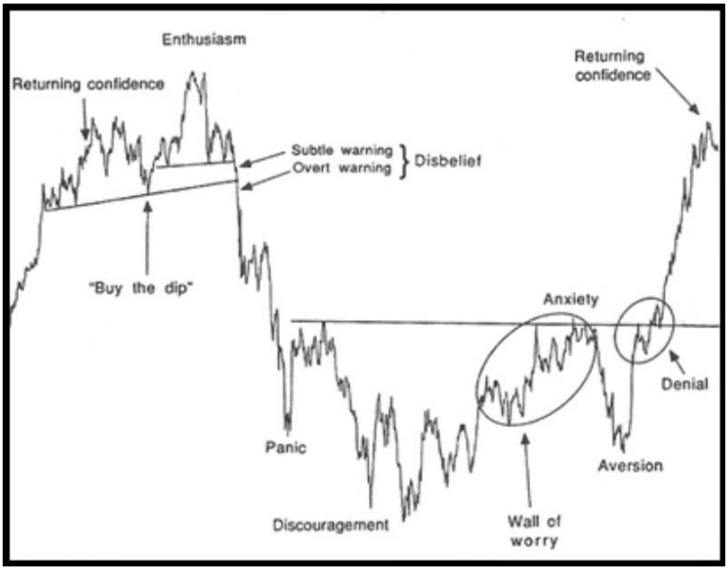
Years ago after switching from a fundamental approach to buying and selling stocks to a technical approach, I asked a mentor of mine to recommend his favorite book on Technical Analysis. Figuring he would go with one of the classics like Technical Analysis of Stock Trends by Edwards & Magee, or Technical Analysis Explained by Martin Pring, I was a bit surprised when he offered up The Nature of Risk by Justin Mamis. In that book is a Sentiment Chart that hangs next to my desk:

Mamis describes this Sentiment Cycle as a graphical representation of the manic depressive moods typically experienced by market participants as a function of time and price in one complete sentiment loop. Anyone who has ever traded a security knows that these moods are very real. While it may seem silly at first glance, there have been countless times where this chart has given me a road map for which to follow as a general outline of what to expect. Case in point, take a look at the chart below of $XBI (SPDR S&P) Biotech ETF and see if you can draw any comparisions to the Mamis Sentiment Cycle…
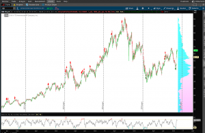
A quick look shows obvious enthusiasm, followed by panic, discouragement, a climb of the “wall of worry”, a dip to aversion and…?
This is one type of analysis I like to clear off my entire chart, leaving only price which is what ultimately pays us. Due to the fractal nature of chart patterns this chart works on both longer term as well as short term charts.
Before starting a position I always take a quick look to see where we might be on the road map of emotion. It is a tool I always suggest to any one looking at entering or exiting any position.