Relative Rotation Graphs (RRGs) are becoming a more mainstream tool among market participants and technicians. This type of analysis is only about a decade old as compared to some other technical tools we have made use of for over 100 years (or more). While this article is not meant to be an in depth instruction guide on how to make use of RRGs, I wanted to make sure I exposed those of you to it who are unaware of how powerful it can be. Speaking with traders every day, I am surprised by how few of them employ this tool, and even more surprised that few have even heard of it.
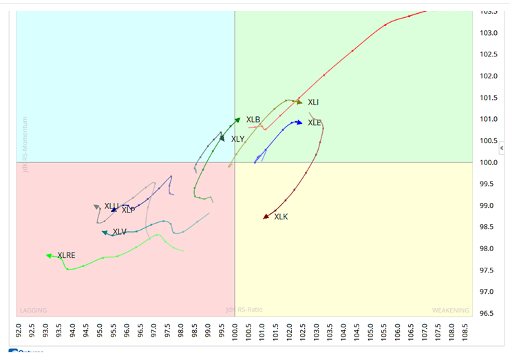
RRGs were developed and trademarked by Julius de Kempenaer of RRG Research in 2004-2005 while working at an investment bank in Amsterdam. Julius was tasked with finding a way to help institutional clients know where to be overweight and underweight in European equity portfolios. They also wanted a way to easily keep an eye on the big picture of relative strength amidst the massive amount of information seen daily. RRGs did just that. These charts show the relative strength as well as momentum of a group of stocks versus other groups as well as a benchmark. For example, we may wish to compare various sectors like XLE (Energy), XLF (Financials), XLK (Tech), and XLY (Discretionary) versus the benchmark S&P 500. RRGs make comparison of groups easy to see, and clearly show leading groups versus lagging groups.
To get an idea how these work you can go here:
http://stockcharts.com/freecharts/rrg/
A basic comparison I put together was the RRG of the Cash Indexes (Dow Jones, NASDAQ, Toronto Stock Exchange, and NYSE Composite Index)

As you can see, there are 4 quadrants: Leading, Weakening, Lagging and Improving. Stocks or sectors with strong momentum are in the top right green quadrant (Leading). As their momentum fades they normally move into the bottom right yellow quadrant (Weakening). If relative strength fades further, they fall into the bottom left quadrant (Lagging), and when momentum improves into the top left quadrant (Improving).
On the link I posted above you can click the ‘Animate” tab and see the sector rotation in action. As with most analysis tools in financial markets, full use of RRGs can get much more complicated. If you are interested in taking a look at a full description of this approach to tracking sector rotation see the following:
Mathew Verdouw, CMT, CFTe and CEO of Optuma Breaks Down RRGs
I highly recommend Optuma if you are interested in RRGs by the way. I have found them to be the easiest to use while still having available all of the expert level tools needed for the professional technician.
In sum, Relative Rotation Graphs are a powerful addition to the array of tools we utilize as market technicians. A basic understanding of RRGs goes a long way in being able to assess the momentum of several sectors against one another, and against a benchmark. This new visual approach is something that is sure to gain a lot of traction in market analysis and I am happy to have it at my disposal.
If you are interested in taking a look at Optuma’s platform and seeing RRGs in action let me know. I know them well and they are great to work with.

@omahacharts